Edana in Trenchbroom

ceriux

Adventurer
Joined
Feb 17, 2005
Messages
2,297
Reaction score
5
Age
35
Location
At my computer :)
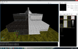
so this isnt to be taken seriously or anything, but i figured id post it. in my free time (very little free time) iv been remaking edana in trencbroom for quake. after the brushwork is done i might work on some custom textures but for the purpose of just mapping out the brushes i just ported over the orginal textures.

as you can tell i pretty much just started. but, i havent really put that much time into it. so it should progress fairly quick i suppose. just figured this might be interesting.
qdana.png
 

Thothie

Administrator
Staff member
Administrator
Moderator
MSC Archivist
Joined
Apr 8, 2005
Messages
16,342
Reaction score
326
Location
lost
Interesting... Doesn't look as though it's flexible enough to adjust for usage with Half-Life though. :\

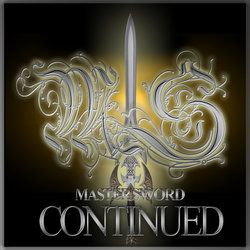
As long as I'm making worthless posts... I need to make a 512x512 logo for greenlight...

ms_logo1_gld.jpg
ms_logo1_drk2.jpg
ms_logo2_hlf.png

Think I've got it down to these three - though I'm not sure if png transparency is allowed as in the last one... Any ideas / critiques / contributions?
 

Monika's_BFFEx0256

Old Skool Apostle
Joined
Mar 9, 2009
Messages
1,359
Reaction score
70
First one is good. Last one is bad. Don't want to let the newcomers know we're a community of trolls, now do we? :roll:
 

Thothie

Administrator
Staff member
Administrator
Moderator
MSC Archivist
Joined
Apr 8, 2005
Messages
16,342
Reaction score
326
Location
lost
At least they'll know what they are getting into. ;)
 

ceriux

Adventurer
Joined
Feb 17, 2005
Messages
2,297
Reaction score
5
Age
35
Location
At my computer :)
well trenchbroom only exports to .map which is what hammer/worldcraft use. but thats not the reason i was making it. its just a for fun project. nice logo's either way.

oh and i like the coloring on the gold one better, but i like the design of the red better.
 

Red Cell

New Adventurer
MSS Developer
MSC Developer
RiP
Joined
Jun 22, 2005
Messages
1,304
Reaction score
0
Location
SMASH
Hold up, lets back up a sec, we got green lit? How did I miss this?

Also, first one looks good.

Also, funny jokes.
 

Monika's_BFFEx0256

Old Skool Apostle
Joined
Mar 9, 2009
Messages
1,359
Reaction score
70
Maybe we should remove all the clearly ripped-off models that people will pick up on from WoW and Morrowind >_>
 

zeus9860

Active Adventurer
The True Followers of the Lost
Crusaders
Blades of Urdual
Alpha Tester
Joined
Feb 28, 2008
Messages
2,581
Reaction score
37
Age
31
Location
lolwut
Go for the last one! :p


I don't know, theme based, the first one is more lore specific no? I got no clue what the "master sword" is meant to be anyways, if it's anything at all. But to my eyes it would have to be something that creates balance, not just good/evil. And since ms:c is in constant change and addition, with multiple races being added and whatnot...

You could try making a logo with both of them, the holy side and the dark side, perhaps with a balancing fusing effect in the middle, like a tiny glimpse of bright light and dark light coming from the middle of the blades as if it were creating balance when both are mixed. Or a shadow/ghost'ish sword in the background, that is not so visible but it's there for a purpose, representing balance.

I'm no expert on image editing but i think it would probably be the best option to tag along with. Not everyone is into holy stuff or dark stuff only, a more balanced logo could create a more appealing approach. Just saying. :wink:

This could even be a way to represent the 3 "main factions", torkalath, urdual and felewyn.
 

Thothie

Administrator
Staff member
Administrator
Moderator
MSC Archivist
Joined
Apr 8, 2005
Messages
16,342
Reaction score
326
Location
lost
That is actually among the things I was considering, some sort of triumvirate set of symbols for Felewyn, Torkie, and Urdual, but then I realized how much work that would be. >< It'd also be difficult to make readily legible and make sense at a glance.

Guess it's the first "golden light" one then... I'd kinda like to have something that had more honest game materials (like the last one) - but it's certainly true that the second one hints at a much darker game than we have. I mean, hell, we still don't have any vampires - just lots of vampire bats and blood. ;)
 

zeus9860

Active Adventurer
The True Followers of the Lost
Crusaders
Blades of Urdual
Alpha Tester
Joined
Feb 28, 2008
Messages
2,581
Reaction score
37
Age
31
Location
lolwut
Rofl, that last one would drive people away as a main logo i bet...

Could always add it to a group of images showcasing content, to make it less obvious.

But hey this is good news, you finally decided to give it a shot? (I forgot what was holding it back the last few discussions) :roll:


@Ceriux

Sorry for the derail, but it had to be done. Moments like this are rare as of late! :twisted:
 

Thothie

Administrator
Staff member
Administrator
Moderator
MSC Archivist
Joined
Apr 8, 2005
Messages
16,342
Reaction score
326
Location
lost
In a weak effort to re-rail Ceriux's thread...

My first thought was to move this to off-topic, since it doesn't actually apply for mapping for MSC. But...

ceriux said:
well trenchbroom only exports to .map which is what hammer/worldcraft use. but thats not the reason i was making it. its just a for fun project. nice logo's either way.

It exports to .map, but it exports to a Quake format, that my *hlt tools don't want to compile... The vector format is the same, so I actually tried to write up a script to convert Quake .map to Half-Life .map format awhile ago, but alas, to no avail (though I never could figure exactly what the problem was).

The thing also doesn't take WAD's - but obviously, you've found a way to convert textures to a format it likes. If you, similarly, have a tool to convert .map formats laying around, then we may have something to talk about.

ceriux said:
oh and i like the coloring on the gold one better, but i like the design of the red better.
Hrmm... Lemme see...

ms_logo1_gld2.jpg
...or maybe...
ms_logo1_gld3.jpg
meh?
 

Thothie

Administrator
Staff member
Administrator
Moderator
MSC Archivist
Joined
Apr 8, 2005
Messages
16,342
Reaction score
326
Location
lost
Sadly, there's not time, but if someone wants to submit something in the next few days, maybe I can do something.

ms_logo_allstars.png

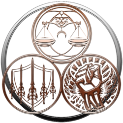
This is the problem I had with the lore oriented approach Zeus mentioned at 512x512. In addition to making sense to very few people - it doesn't leave room for werdz (namely "Master Sword: Continued"). But, at least we have official symbols for all the gods now... Really gotta remember to add them to the default spray paints.

Speaking of words, I was also supposed to write up a quick blurb for the Greenlight page:

Blurb said:
Enter the world of Leann, where gods of order and chaos wage a never ending battle through elves, orcs, dwarves, and men, as they vie for control of the lands of Daragoth.

Mastersword: Continued is a first person on-line role playing game, forged in the earliest days of the Half-Life engine. Over decades, it has evolved into an ever expanding, community built mod, consisting of over eighty unique maps, hundreds of monsters, and a vast array of weapon and spells with which to do battle against them. Endless adventure awaits in this free-to-play MORPG world, every bit of which has been painstakingly crafted by its many devoted fans.
Dunno if that's worth putting up for scrutiny, but any excuse to dick around some more...

Lucifer Majiskus said:
Maybe we should remove all the clearly ripped-off models that people will pick up on from WoW and Morrowind >_>

Meh, there's a huge post in the developer section regarding a task list for that. The good news is, the ones you mention make up maybe four or five late game models. The bad news is, we've considerably less than that many modelers working on the project. (Infinitely less, really.) :(
 

ceriux

Adventurer
Joined
Feb 17, 2005
Messages
2,297
Reaction score
5
Age
35
Location
At my computer :)
this one thothie =)

http://www.thothie.com/msc_dev4/ms_logo1_gld2.jpg

the one with the model looks a bit too lazy/generic to me. i think that one looks more professional.

also i got a bit futher on edana in tb. but its been crashing. maybe ill try an older build. but the developer of tb has started over from scratch to get a cleaner/more stable build and less hackery. (so the thread hijack is no big deal, not that i cared either way)

btw you should be able to open the quake.map in valve hammer editor then resave it. just make sure you use the same .wad with names/textures. i simply opened edana.wad in wally and copied the textures over in to a quake.wad. i believe i named it the same "edana.wad". but once you open it in hammer just re-save it/compile it.

might even be able to use jackhammer for the conversion.

http://jackhammer.hlfx.ru/en/features.html
 

Thothie

Administrator
Staff member
Administrator
Moderator
MSC Archivist
Joined
Apr 8, 2005
Messages
16,342
Reaction score
326
Location
lost
I couldn't get Hammer to import the .map's made by another Quake tool (can't recall which one - maybe Quark), but I'll give it a go, and give Jackhammer a shot at it should that fail. (Reminds me, I need to update that thing - they promised me they'd add space=scroll ability.)
 

zeus9860

Active Adventurer
The True Followers of the Lost
Crusaders
Blades of Urdual
Alpha Tester
Joined
Feb 28, 2008
Messages
2,581
Reaction score
37
Age
31
Location
lolwut
I think the one with the symbols would mean more to the players... but yeah it's ignoring the game's title by not having anything direclty related to it in the logo.

There is an alternative way of doing this, entirelly up to you if you want to give it a shot or not, i would if i had the skills to (i'm being honest here, i really suck at image editing). Put all 3 swords in the same logo, standing vertically, from left to right. Each of them having their own background aura, while the background itself remains dark.

-Dark background, represents the darkness that roams the land in our current age;
-To the left, the order side represented by the yellow sword and aura (slowly fading away, turning white as it approaches the middle blade's aura field);
-In the middle, the balance side, represented by the fully detailed sword, it should represent balance (not sure if this goes with the lore properly, it's my opinion, not implying that it really needs to be this way) or alternativelly it could represent order, as in the thing that will restore proper balance to the world (light of hope, shining in the darkness), the aura could share a white + grey or white + black coloring;
-To the right, the chaotic side, represented by the red side, red aura that fades away to black/grey as it approaches the middle.

The runes or w/e those things are in the front of the blade, they could remain the same as they are in the fully detailed sword.


PS: What kind of software are you using for this stuff? I could mess around, but i highly doubt i'll create anything better than those you already made, haha. :oops:
 

Thothie

Administrator
Staff member
Administrator
Moderator
MSC Archivist
Joined
Apr 8, 2005
Messages
16,342
Reaction score
326
Location
lost
I'm just having trouble envisioning a way to do that, and make it legible and recognizable, at 512x512. ...Though we wouldn't necessarily have to use the same sword - we have models for the other two god's Apostle weapons and their fragments. (And they are actually 100% OC.)

I'm currently using a portable version of Adobe Photoshop CS4 that I really like, but it's retail... I think you can get a free version/trial of Photoshop CC over here.

And, what the hey, here's my source material:
http://www.thothie.com/msc_dev4/logos.rar

^ That includes the source PSD's for all these, the stencils for all of the god's holy symbols, plus some variants, and some source PSD's for a few other things - such as the MSS logo... It also has all the fonts used (I think), plus a few extras... Comes to about 60MB - but beware, my host is slow as f*ck.
 
Top